Wednesday, July 28, 2010
Tuesday, July 20, 2010
no angel came
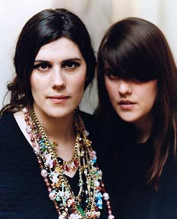
This week, fashion brand Rodarte (designer sisters Kate and Laura Mulleavy) announced a collaboration with MAC cosmetics. In today's world of high fashion meets high street partnerships, this announcement seemed perfectly normal, and the line was a sure success given the popularity of other similar projects. Instead, the Mulleavy sisters are now being met with a ton of criticism given the inspiration of their cosmetic line (linked to their previous fashion collection) - a road trip across the US border into Mexico - and subsequently the names of some of the products - eg: 'Juarez' and 'Factory' are nailpolish shades in the collection. Many critics are calling this distasteful, given the many social problems in the impoverished areas that the Rodarte sisters were inspired by, as well as the fact that these are cosmetic products, and have essentially no meaning beyond that, so why weigh them down with such heavy issues? Is this really raising awareness? MAC are now backpedaling after the uproar online and assuring customers that some proceeds will go towards charities in the Juarez area.
Obviously fashion, and more widely, art, wouldn't be where it is today without people pushing boundaries and finding inspiration in the not-so-peaches-and-cream parts of life. But under what circumstances is one "allowed" to use tragedy and the suffering of others as crucial elements of one's art? Personally I don't think there should be any rules about where to source your inspiration from, but the execution must be flawless. If one is to use say, the horrible situation in Juarez as the stimulus point for a work, I think the answer lies in the result. Is the final product successful in conveying a message or raising awareness? Or does is come off as a weak attempt at social commentary? Or worse, is the inspiration being used solely as a means to make money? This is where it comes in handy to be critical and informed.
I feel a bit foolish making a post about something I am decidedly undecided about but still. By blabbering about it with myself, I hope to eventually come to a point where I have a concrete opinion on the wider issue. In this case, I can see both sides of the argument, and as much as I want to side with the 'artists', I feel as a makeup line, it really doesn't send any kind of message other than the commodification of a tragic situation. Unfortunately for the Mulleavy sisters, I think their intentions are irrelevant in this instance. Obviously they did not go into this thinking to mitigate the horrific rates of rapes, homicides and constant gang/drug related violence in the city of Juarez - it's very likely that they wanted to draw attention to these problems. But as I said, the end result speaks for itself and from where I stand, this is an oversight on their part that has come off as very ignorant and too flighty to send the right message.
Monday, July 19, 2010
monday links
- A beautiful (but unsatisfyingly small) selection of fashion illustrations, among other things, by Sophie McKay, here.
- Tom Wants a Job, a really fantastic blog by a journalism graduate looking for a job in the industry. Funny and real, I loved reading through all the posts and I can't wait for my own Katie-Wants-a-Job, not blog but general experiences once I graduate.
- My Culture is Not a Trend, shedding light on cultural appropriation and its negative consequences.
- Selfridges department store is opening a 'Forever' shop, selling only items that have stood the test of time (think Burberry trenches, Hermes scarves, classic books and even Bic lighters!). Such a solid, modern shopping idea, I can't wait to see it. Read more here.
- This blog post about dogs made me cry with laughter for HOURS ON END yesterday. I couldn't even get through the comments because they were making me laugh so much. Just read it. Thank me later.
Sunday, July 4, 2010
why judging a book by its cover ain't so bad
Typography, layout and design are all areas that you only realise the importance of when you really think about them. When you read the newspaper, a magazine, anything, you're taking it at face value, and your average reader will not question any of these elements. They are actually rather crucial elements to any given publication, and could sway a whole range of people to either read on or turn the page.
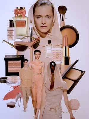
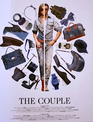
I came across Tush magazine on my travels earlier this year. I was sitting around at Charles de Gaulle airport waiting for a flight and I took my usual trip to the newsagent stand to buy reading material/chocolate. I instantly picked a copy of Tush up. Ranya Mordanova was on the cover and she is so striking. If I had taken five seconds out of my Ranya moment, I would probably have noticed that the magazine is written entirely in German, thus incomprehensible for me. I only realised this once I sat down to read it properly several days later, after much ooohing and aaahing at the gorgeous images inside. While first I laughed at my stupidity, I then realised that it didn't matter, because for me it was the visual hit that really drew me in, regardless of the quality written content it may or may not contain. It's so refreshing to see such original and arresting visual work, rather than the average, tried-and-tested presentation that most magazines have.
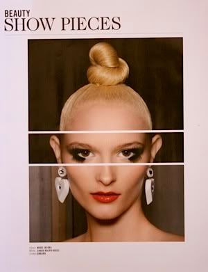
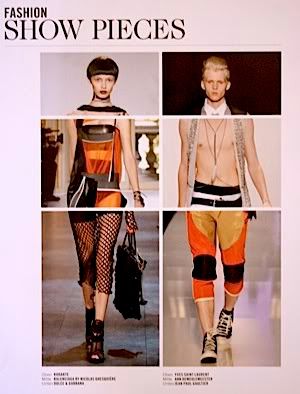
Tush magazine is just one publication that is proof of clever and beautiful design being able to transcend all kinds of boundaries. Locally, I think Russh is probably the best example. Their Style Icon, Fashion Album and Mix and Match pages are all fantastic.
[images are my crappy scans from the first 2010 issue of Tush]


I came across Tush magazine on my travels earlier this year. I was sitting around at Charles de Gaulle airport waiting for a flight and I took my usual trip to the newsagent stand to buy reading material/chocolate. I instantly picked a copy of Tush up. Ranya Mordanova was on the cover and she is so striking. If I had taken five seconds out of my Ranya moment, I would probably have noticed that the magazine is written entirely in German, thus incomprehensible for me. I only realised this once I sat down to read it properly several days later, after much ooohing and aaahing at the gorgeous images inside. While first I laughed at my stupidity, I then realised that it didn't matter, because for me it was the visual hit that really drew me in, regardless of the quality written content it may or may not contain. It's so refreshing to see such original and arresting visual work, rather than the average, tried-and-tested presentation that most magazines have.


Tush magazine is just one publication that is proof of clever and beautiful design being able to transcend all kinds of boundaries. Locally, I think Russh is probably the best example. Their Style Icon, Fashion Album and Mix and Match pages are all fantastic.
[images are my crappy scans from the first 2010 issue of Tush]
Friday, July 2, 2010
pinhead
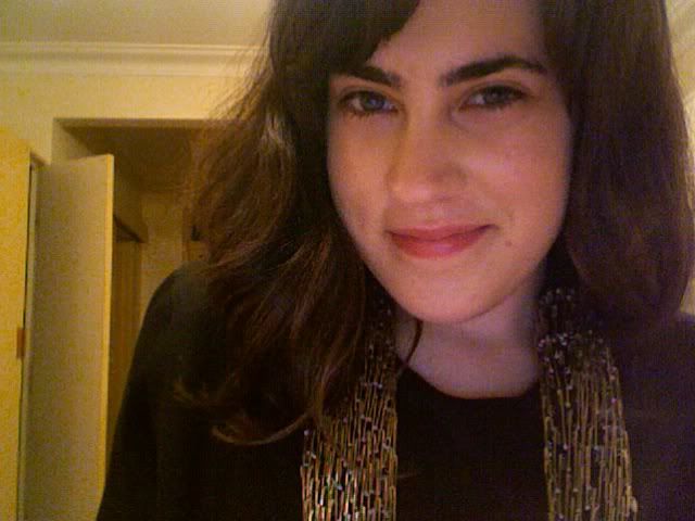
So yesterday I scored this AMAZING Romance Was Born 'Pinhead' jacket on sale at My Catwalk and received it today in the mail (next day delivery is a girl's best friend). The collar and most of the inner lining at the front are covered with safety pins, and the back is slightly longer and beautifully sheer. Holy wow. This and coffee with old high school friends have made an incredibly gloomy (note the rain-soaked, now frizzy hair) Friday turn wonderful.
Subscribe to:
Comments (Atom)


