
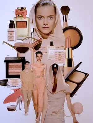
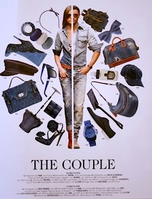
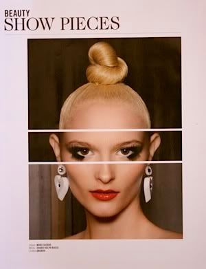
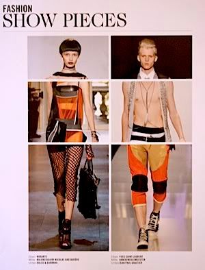
I came across Tush magazine on my travels earlier this year. I was sitting around at Charles de Gaulle airport waiting for a flight and I took my usual trip to the newsagent stand to buy reading material/chocolate. I instantly picked a copy of Tush up. Ranya Mordanova was on the cover and she is so striking. If I had taken five seconds out of my Ranya moment, I would probably have noticed that the magazine is written entirely in German, thus incomprehensible for me. I only realised this once I sat down to read it properly several days later, after much ooohing and aaahing at the gorgeous images inside. While first I laughed at my stupidity, I then realised that it didn't matter, because for me it was the visual hit that really drew me in, regardless of the quality written content it may or may not contain. It's so refreshing to see such original and arresting visual work, rather than the average, tried-and-tested presentation that most magazines have.
Tush magazine is just one publication that is proof of clever and beautiful design being able to transcend all kinds of boundaries. Locally, I think Russh is probably the best example. Their Style Icon, Fashion Album and Mix and Match pages are all fantastic.
[images are my crappy scans from the first 2010 issue of Tush]


No comments:
Post a Comment